The South African artist Christopher Smith, known for his Instagram account dedicated to transformative self-portraiture, has brilliantly captured and reimagined the themes of Acne Paper, Acne Studios’ in-house magazine that ran for 15 issues between 2007 and 2014.
This diverse photographic series is on exhibition at the Swedish brand’s newest Paris address on the historic rue Saint Honoré, which will join their network of Parisian boutiques in early 2022. The event also marks the launch of an upcoming book commemorating Acne Paper’s history, which was specially commissioned by Acne Studios founder and creative director Johnny Johansson, and masterminded by Acne Paper’s returning editor-in-chief Thomas Persson. When the magazine first launched it was as academic as it was glamorous in nature, and consisted of a typically unconventional yet promising list of contributors. Using this special release of the ‘best of’ Acne Paper book, the magazine also announces its return to newsstands later this year.
The large-format book compiles the magazine’s 15-issue history into 500 pages, encased in an armour of dark green protecting the collectible print object, and contains essays by Sarah Mower, Vince Aletti, Robin Muir and Bjørn Hansteen-Fossum, reexploring the magazine’s themes, its founders, the photographs and its ongoing legacy. But what might be most striking are the newly commissioned photographs by Christopher Smith; one features on the cover: the artist’s interpretation of Acne Paper’s Spring 2007 issue ‘Playfulness’. According to a conversation between Smith and Persson, Smith ‘chose to be the faun, a mythological figure whose particular traits have much in common with our magazine,’ referencing the artistic and historical leanings of the magazine’s ethos. Through the construction of character-driven personages via illustrative vintage costumes and striking makeup, Smith’s photographs invite us into an intimate introspection of its own kind. Each image imitates the many hidden, isolated and remote identities existent within all of us.
Scroll below to read A Magazine Curated By in conversation with Christopher Smith.

Escapism © Christopher Smith / courtesy The Ravestijn Gallery
Kanika Agarwal (KA): Can you tell us a little bit about yourself and how you first got into photography?
Christopher Smith (CS): Well, I’m 26 years old and live in the coastal city of Gqebera (formerly Port Elizabeth) in South Africa and I first got into photography in 9th grade when I started taking pictures of myself with my cellphone camera. I enjoyed the process of creating images and really became obsessed with aspects like the background and set and how lighting, hair and makeup could be used to create a mood. I had to rely on all I could to make the pictures feel more interesting than they actually were since I was only working from my bedroom with myself. It felt like I was making tiny movies and I loved it. Eventually, I got a little digital camera and started to really take photography seriously, and wanted to learn all I could about it. At first, I was influenced by what was around me, movies and magazines, but eventually, I became more obsessed with the entire history of photography and especially the history of fashion and style.
KA: Has the pandemic concentrated, evolved, or fast-tracked your practice of self-portraiture at all, though you began these years before?
Well, it’s really fast-tracked my desire to take pictures of other people which I did last year for the first time. That was my ‘trial run’ so to speak and, like with the self-portraits, I did everything other than being the model. I mean, I love doing self-portraits, but it really started as a necessity for me to learn and experiment with photography on my own, but it’s never been all I wanted to do. Truthfully, I’ve always wanted to be a fashion photographer, and honestly, I look at most of my self-portraiture as fashion photography. I feel like I am just a stand-in for the models. Once the pandemic has abated, it’s the area I want to seriously focus on.
KA: How did you approach the portraits for Acne Paper, based on the past 15 issues? Did you have instant ideas for any?
It’s never instant with me, I wish it was, but of course, some are easier to think of than others. Commissions are easier in general because there are certain parameters I’m given beforehand, which helps me focus. I really had to think about the majority of the images, but it’s not something I do in a very ordered way. Sometimes I just trust my instincts and other times I spend quite some time reading up on topics. I love finding out about things. Right before I do a picture, I become obsessed with the thing (or idea) I’m photographing and then I move on to the next one.

Playfulness © Christopher Smith for Acne Paper
KA: What inspires you to create these images? In addition to visually referencing history, one could argue escaping, or evading reality is a recurring motif throughout your work. Did this help you to illustrate the imagery for Acne Paper’s Escapism issue naturally?
Yes, I think escaping reality is definitely a recurring motif in my work. Escapism was the first image I did actually, but I have to say, I don’t self-consciously consider how the ideas relate to me personally. Does the escapism image say something broader about me and my work? Maybe, but that’s not what I was thinking before I did it. I just thought the image of a boy sleeping on a cloud with a red eye above him would be right for the issue’s theme. I draw inspiration from all kinds of places like photography, fashion, movies, music, books, painting, sculpture, and so on. It really depends on the image required or my mood at the time.
The one image where I was consciously thinking of myself was for The Artist’s Studio. Me, on my bed, asleep and surrounded by my books. That, I feel, sums me up and is a kind of honest self-portrait. It’s actually my mother’s favorite picture of me and I think that says it all.
KA: Which image do you feel most excited about from this series for Acne Paper?
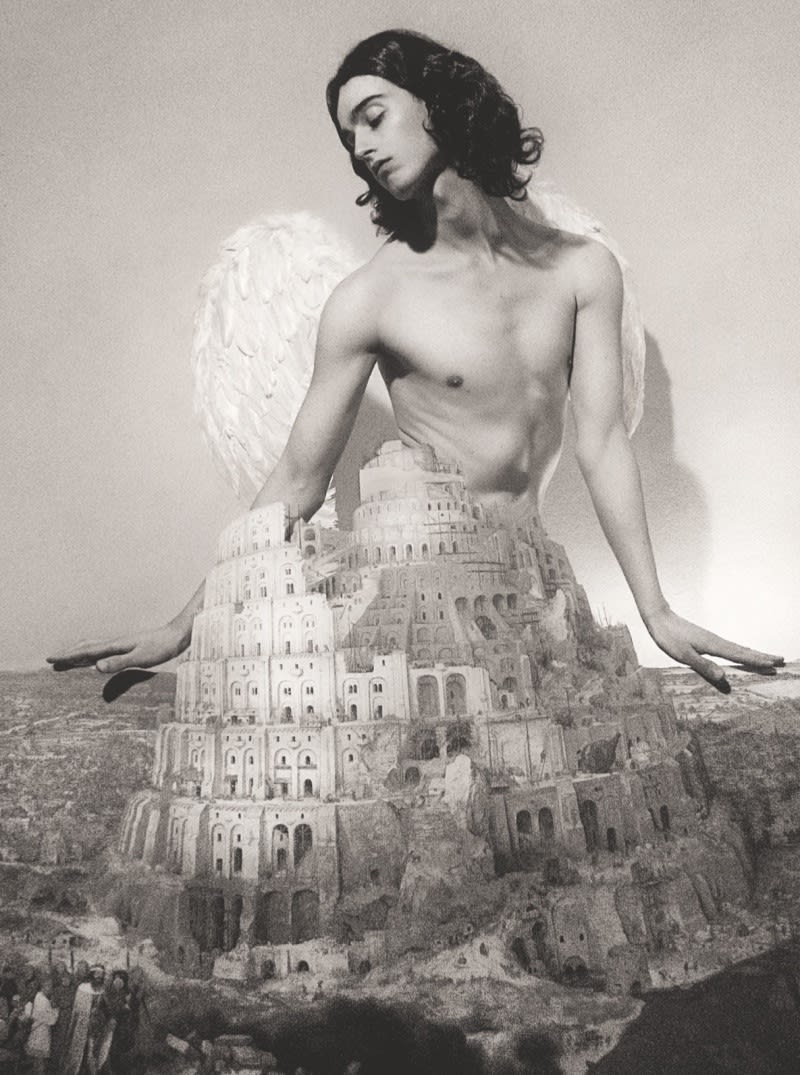
I really like The City, just because it turned out exactly as I imagined it.

The City © Christopher Smith for Acne Paper
KA: How does it feel to witness your first cover come to life, after finding recognition via Instagram?
Well, it’s such a thrill! I mean, I love having my work exist online on Instagram, but to have a body of work collected in a book is great. It feels more permanent and long-lasting than Instagram.
KA: Did you teach yourself how to photograph, edit, style, and do hair & makeup?
Yes, and that was why I initially used myself in the pictures. I mean, I didn’t know anything about photography when I was 15 and 16, but I knew the kinds of images I liked and I thought that rather than subjecting a model to my incompetence, I would just use myself so that I could learn without any pressure. I also never wanted to be someone who just recorded things, I always thought it was important to editorialize which is why I wanted to learn and be able to do everything on my own so that any image I did really felt like mine. Beyond that, I never want to be in a position where I’m telling people like hair and makeup artists or set designers or models what to do, without understanding the hard work that goes into it all. And it really is hard work!
All that said though, I think of myself first and foremost as a photographer. Everything else that I do is more out of necessity than deep-seated passion.
KA: In terms of technical composition, what is your process for creating an image from first imagining it, to the final product?
Well, the ideas I have can come from anywhere really. Sometimes I really stop and ask myself how I’m feeling or what I’d like to try and other times, an idea can come from a music video I’ve seen or an old wig or dress I have lying around. Once I have a blurry image in my head, I start looking for all that I need to do it: the right wig, the backdrop, makeup, clothes, accessories, props and so on. Once I’ve got all that, I usually do a run-through where I try on the wigs and accessories or clothes and see how everything fits together and whether I need to add or take away any elements. This whole process can take a couple of days. Once I feel like I have everything, I decide when I want to take the picture, usually the next day/night. The actual sitting is quite straightforward and rigid, since the attitude and pose have usually been decided beforehand.
The time from idea to actual execution varies too. Sometimes I can have images floating in my head for months or years before I decide to actually do them, other times I may come up with an idea and execute it in the same week. Sometimes, I go through periods where I don’t feel particularly inspired at all, usually when I’m stressed. So, the kinds of pictures I do really depend on how I’m feeling at any given moment.

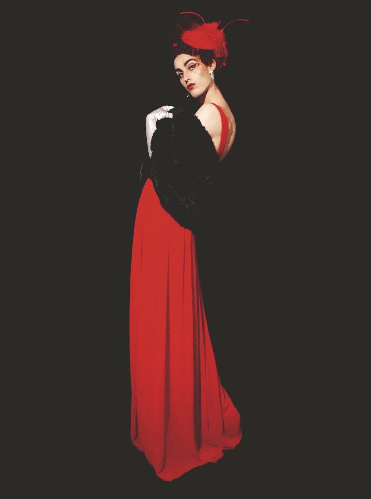
Elegance © Christopher Smith for Acne Paper
KA: Your images have lots of different treatments to illustrate a variety of decades, atmospheres, and creative possibilities. Do you work a lot with postproduction to achieve certain effects?
Lighting, colours, clothes, hair and makeup, and pose usually do the heavy-lifting when it comes to atmosphere and mood, but of course, post production plays a role. The real world is boring to me and I don’t want to be restricted by ‘reality.’ I want to see people and situations that are more beautiful or fantastical or glamorous or grotesque than I could ever see in ‘real’ life.
KA: Which has been the most difficult image to create? What challenges have you had to overcome?
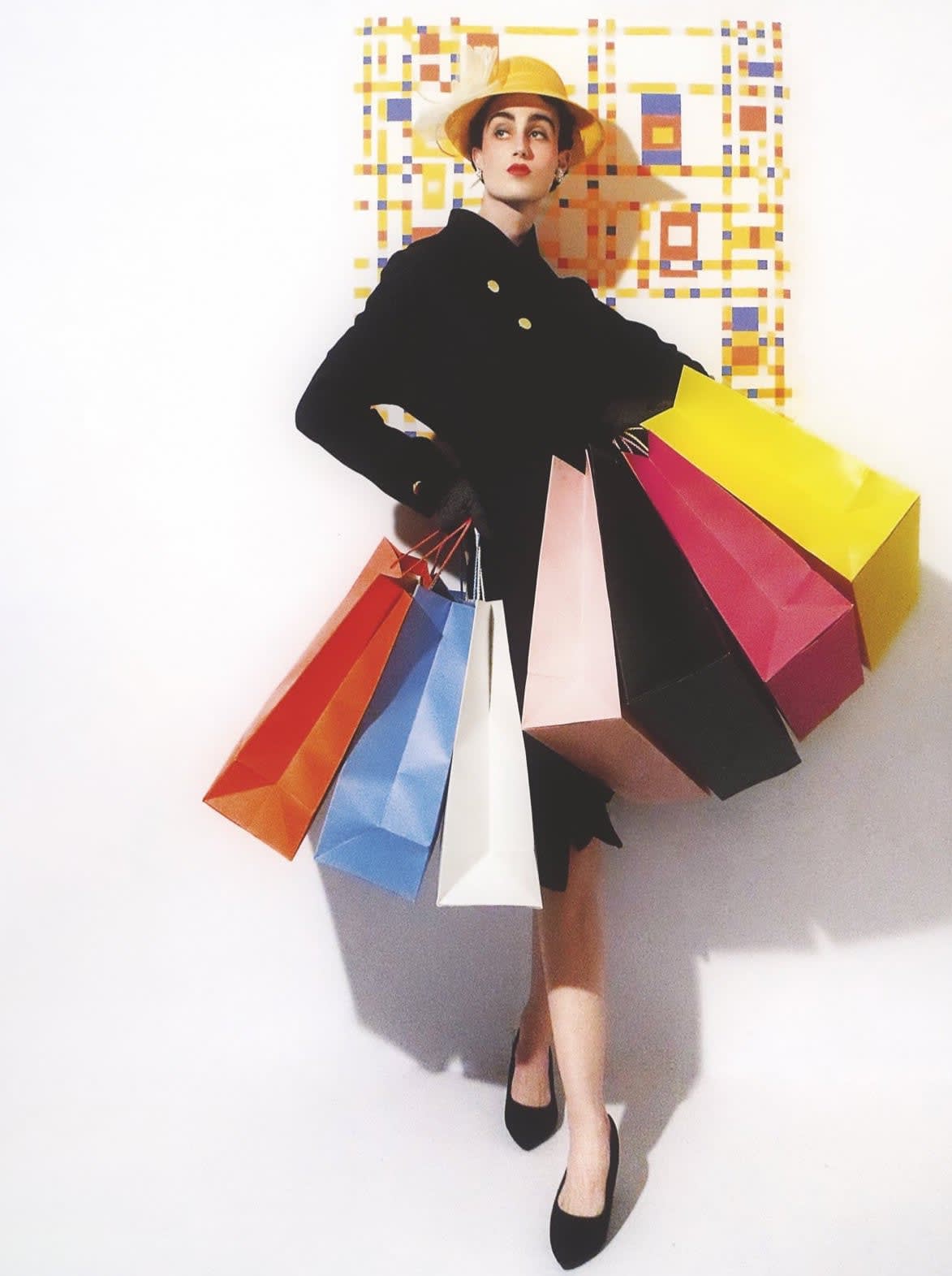
Manhattan was the most difficult one actually, just because I don’t really have much authority on it. I’m not from there and I’ve only ever visited once so I was stuck on it for a while and it ended up being the last one I did. In my head, I think of Manhattan as a hub for art and commerce, so I thought of a fashionable woman with all her shopping bags in front of Mondrian’s Broadway Boogie-Woogie. An actual juxtaposition of art and commerce.

Manhattan © Christopher Smith for Acne Paper
KA: Your image for The City is particularly interesting. Is that collage on top of portraiture? Can you walk us through this portrayal?
CS: Well, I thought of Bruegel’s Tower of Babel as the prototypical image of a city. So I had a large print made on card stock which I cut the sky out of and put against my full-length mirror and kneeled behind as an angel looking over the citizens of ill-fated Babel. I suppose the final effect is a kind of real-life collage. I like that image because it was quite straightforward to do and it came out exactly as I imagined it would.

